Here are some questions that were emailed to me by a reader…. #1 – If I have a run of 8 signals and need to recalculate my UCL and LCL, do I start the new limits with the first of the 8, the last of …
Read MoreUsing PBCs to Evaluate Changes in PSA Levels
Here is a journal article that was co-authored by Donald J. Wheeler, PhD and Albert Pfadt: Single Subject Studies in Prostate Cancer: How graphing PSA test results and testosterone levels using Process Behavior and Celeration Charts can provide insight and guide clinical decisions From the …
Read MoreHas Nurse Turnover Changed?
Here’s a great video from my friend Skip Steward: An image of the Process Behavior Chart:
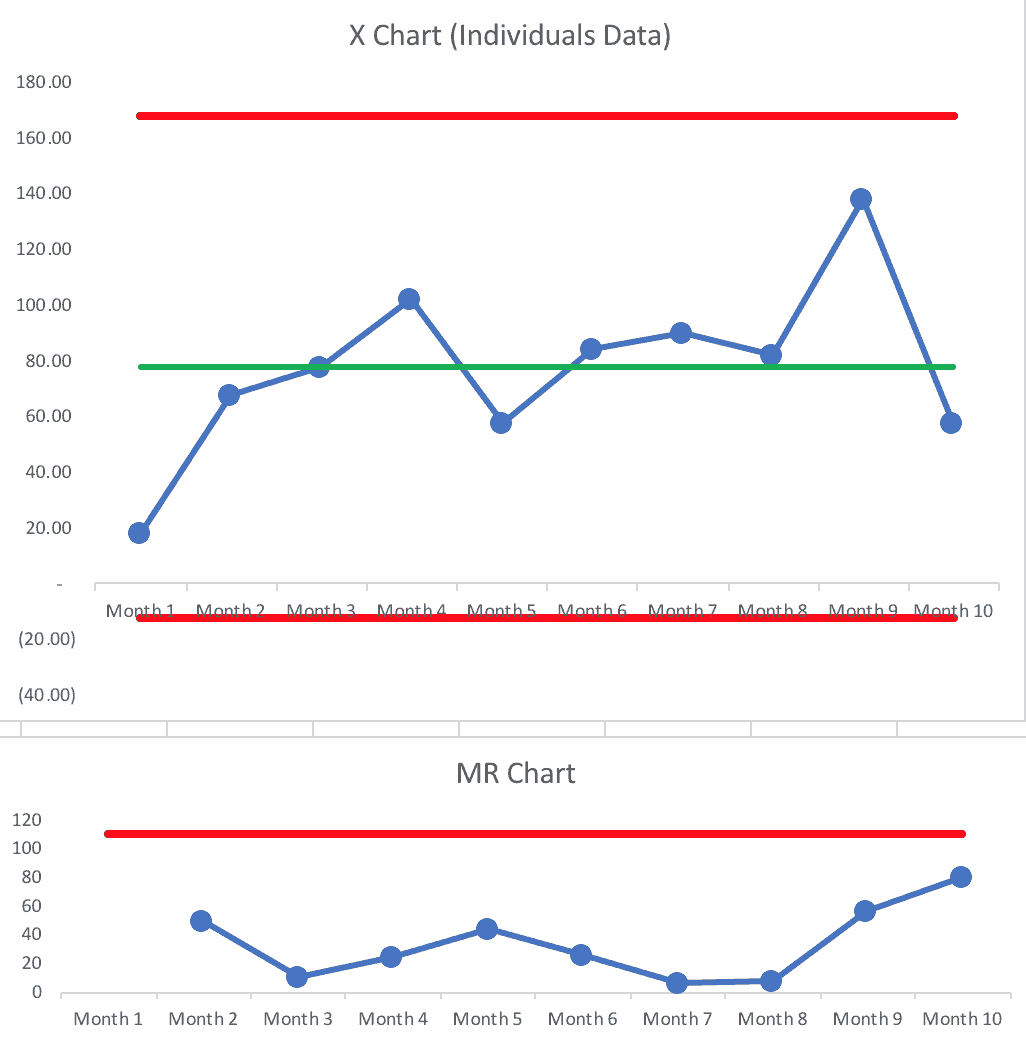
Read MoreDid This Intervention Reduce Blood Culture Contamination Rates?
Here is a Process Behavior Chart looking at blood culture contamination rates for a hospital lab. See the original blog post.
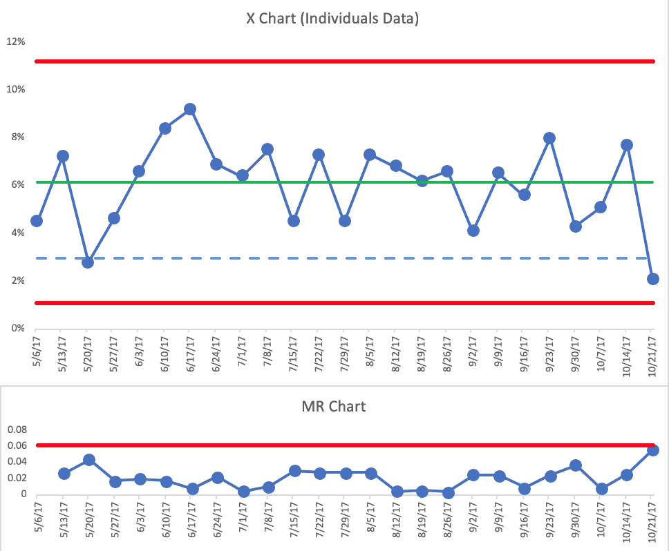
See the entire blog post at LeanBlog.org:
Did This Intervention Reduce Blood Culture Contamination Rates?
Read More
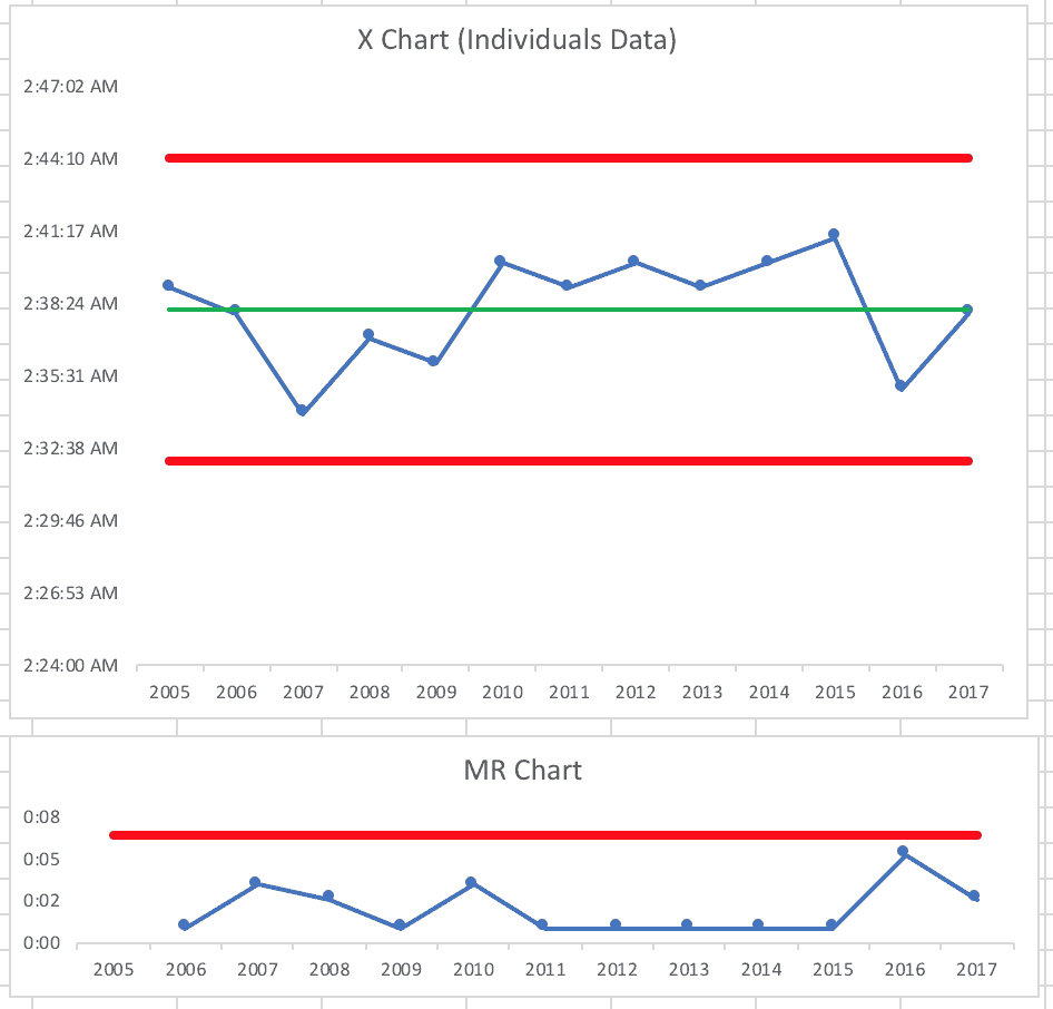
“ER wait times down, but only slightly” or ER wait times are virtually the same?
Here is an “X Chart” (part of the Process Behavior Chart methodology) looking at emergency department patient waiting times. See the original blog post.
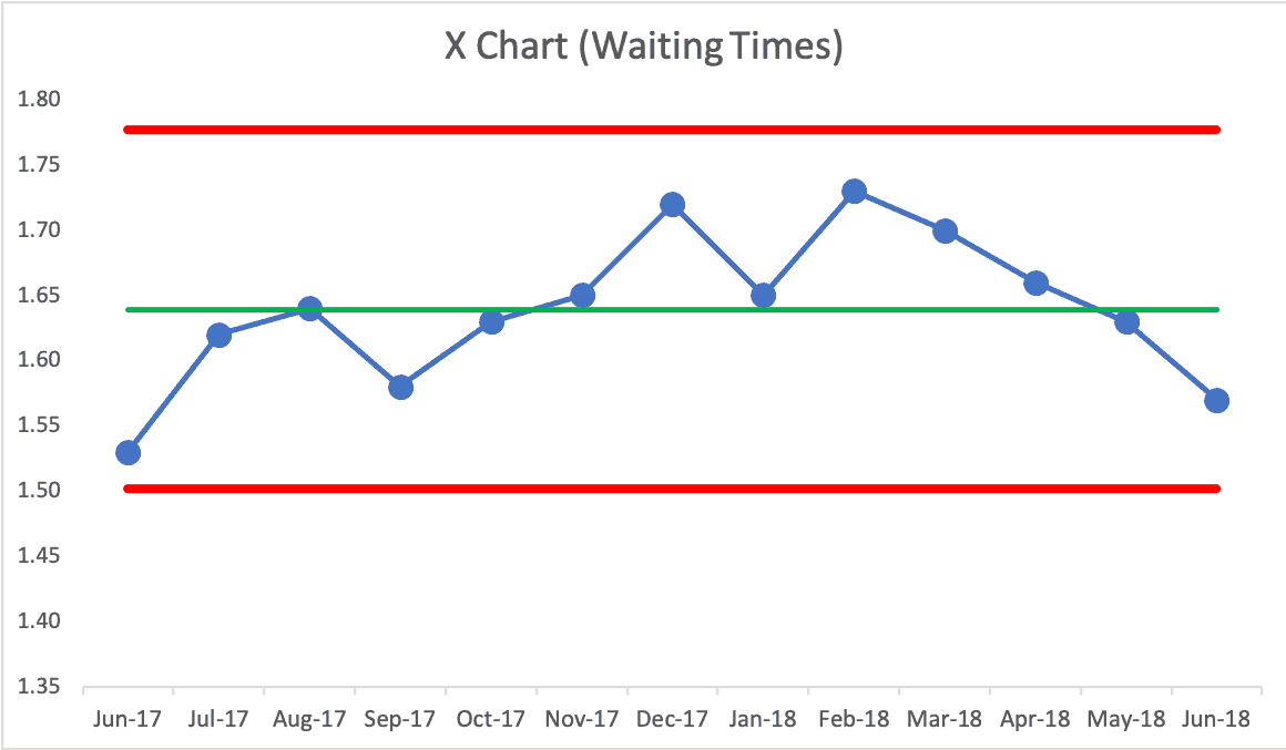
See the entire blog post at LeanBlog.org:
“ER wait times down, but only slightly” or ER wait times are virtually the same?
Read More
Context and a “Process Behavior Chart” Instead of Two Data Points: Reshoring Statistics
Somebody at A.T. Kearney sent me a link to their recent report on reshoring, with the headline:
Reshoring in Reverse Again
US manufacturers are not exactly coming back in droves. In fact, the 2018 Reshoring Index shows that imports from traditional offshoring countries are at a record high.
Long story short, I created this chart:
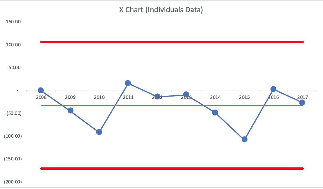
Read MoreContext and a “Process Behavior Chart” Instead of Two Data Points: Reshoring Statistics