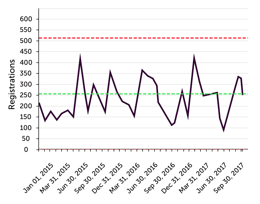
Here is a Process Behavior Chart looking at blood culture contamination rates for a hospital lab. See the original blog post.
See the entire blog post at LeanBlog.org:
Did This Intervention Reduce Blood Culture Contamination Rates?
Read More

Measures of Success – By Mark Graban
React Less. Lead Better. Improve More.
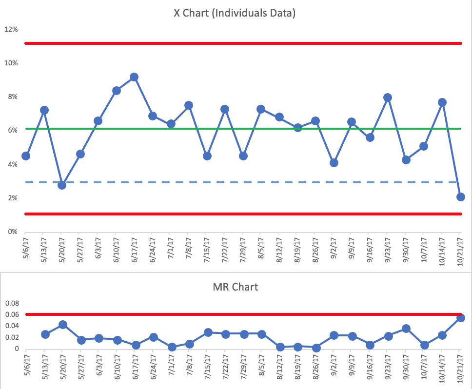
Here is a Process Behavior Chart looking at blood culture contamination rates for a hospital lab. See the original blog post.
See the entire blog post at LeanBlog.org:
Did This Intervention Reduce Blood Culture Contamination Rates?
Read More
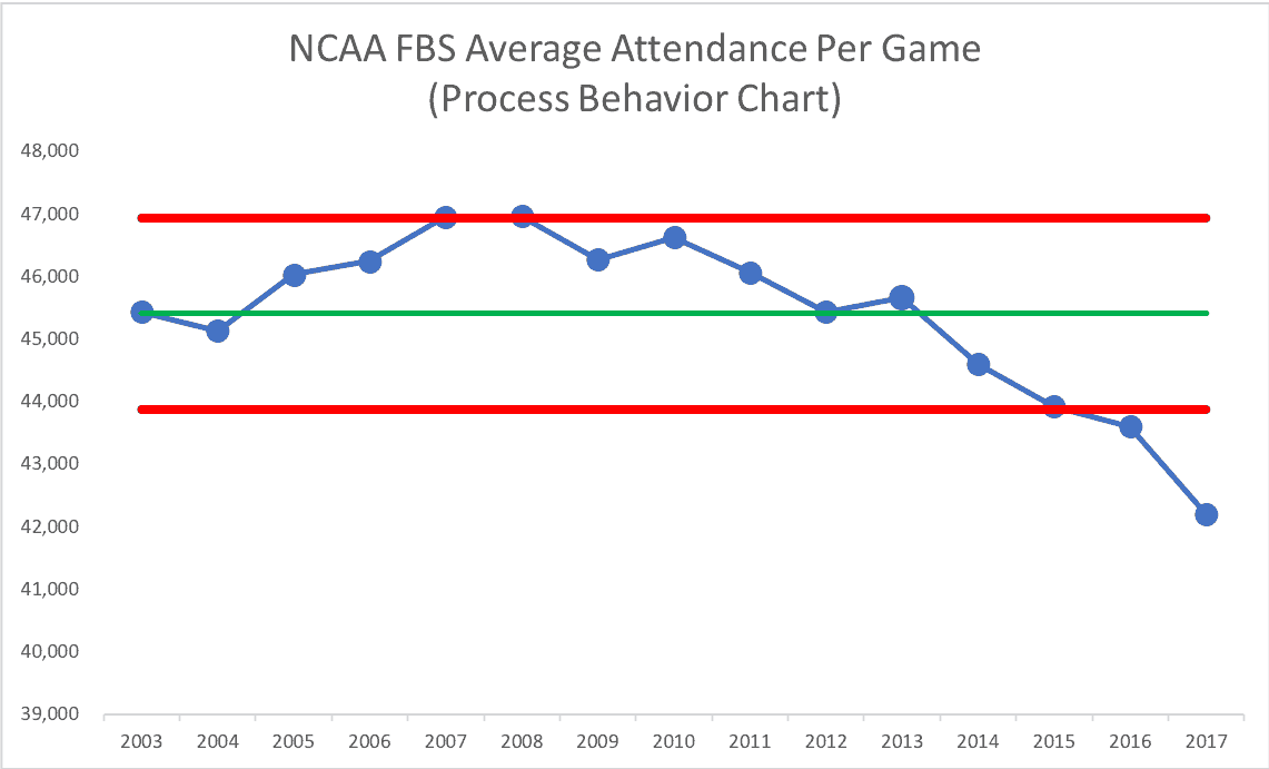
Here is an “X Chart” (part of the Process Behavior Chart methodology) looking at emergency department patient waiting times. See the original blog post.
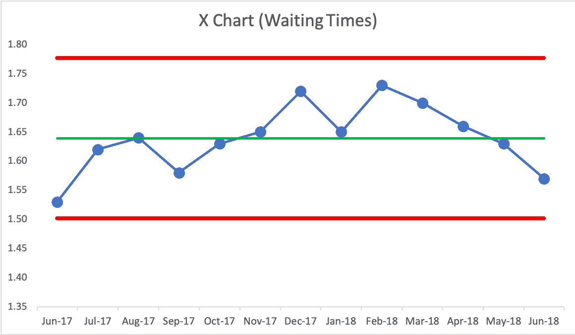
See the entire blog post at LeanBlog.org:
“ER wait times down, but only slightly” or ER wait times are virtually the same?
Read More
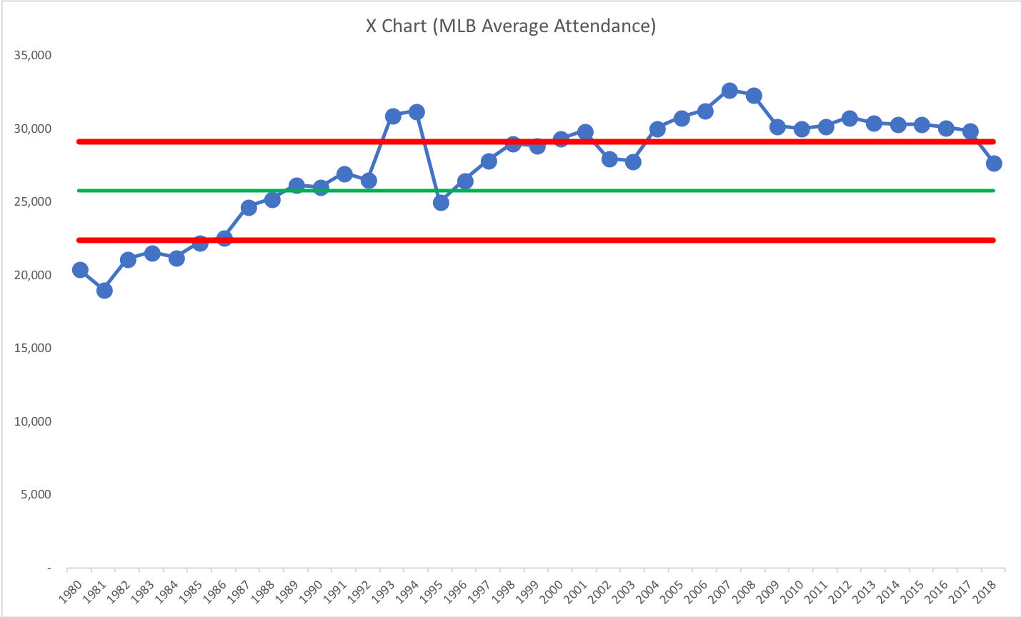
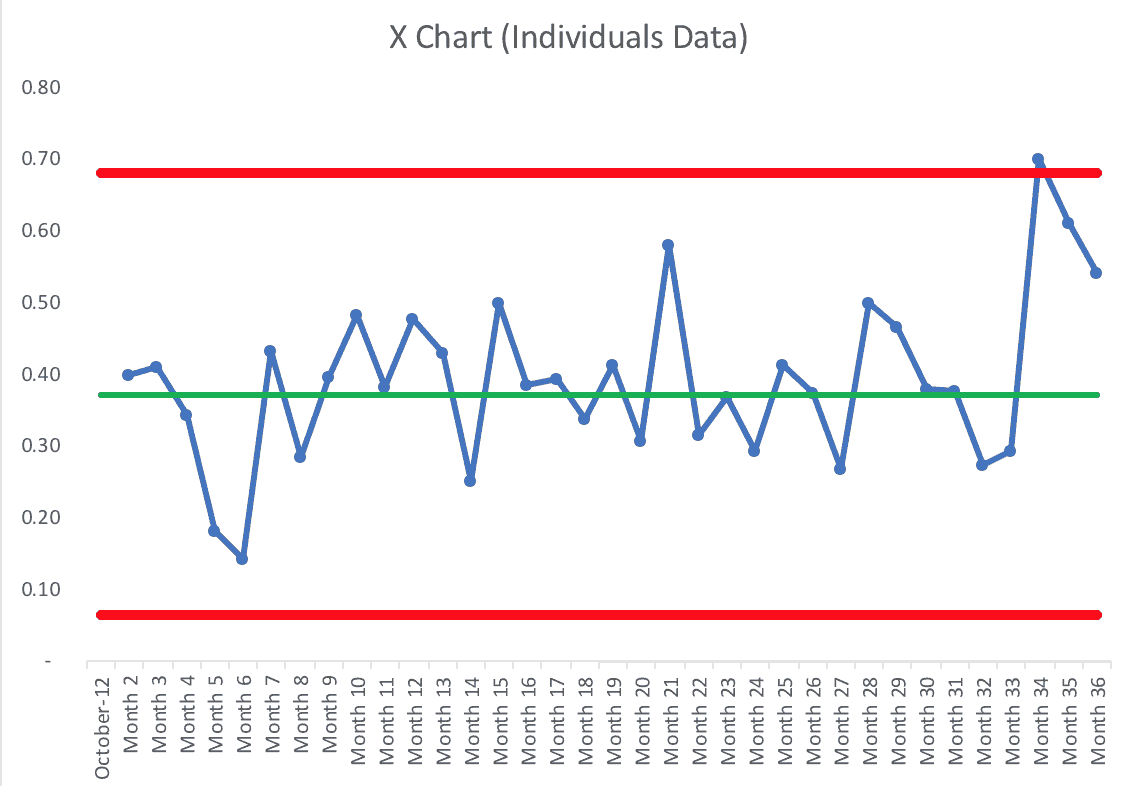
Somebody at A.T. Kearney sent me a link to their recent report on reshoring, with the headline:
Reshoring in Reverse Again
US manufacturers are not exactly coming back in droves. In fact, the 2018 Reshoring Index shows that imports from traditional offshoring countries are at a record high.
Long story short, I created this chart:
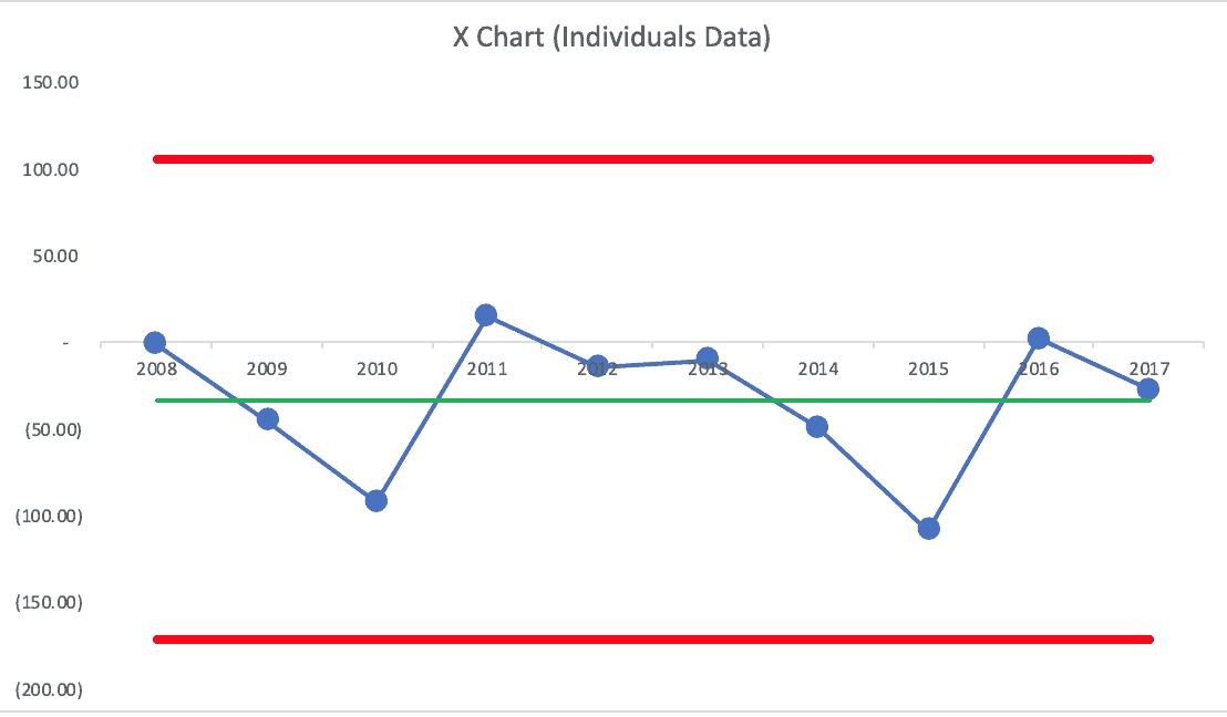
Read MoreContext and a “Process Behavior Chart” Instead of Two Data Points: Reshoring Statistics