
I’ve gotten this question a few times recently, basically asking if it’s OK to plot metrics like these on a Process Behavior Chart (PBC):
- Weekly average emergency patient waiting time
- Monthly average lost sick days
- Daily median waiting time for clinic patients
The concern gets expressed in terms of, “I was taught it was dangerous to take an average of averages.” See here for an example of that math dilemma, which is worth paying attention to in other circumstances. We don’t need to worry about it with PBCs.
In a PBC, we are plotting a central line that’s usually the average of the data points that we are analyzing. So, it’s an average of averages, but it’s less problematic in this context.
I asked Donald J. Wheeler, PhD about this and he replied:
“The advantage of the XmR chart is that the variation is characterized after the data have been transformed.Thus, we can transform the data in any way that makes sense in the context, and then place these values on an XmR chart.“
PBC is another name for the XmR chart method.
In his excellent textbook Making Sense of Data, Wheeler plots weekly averages with no warnings about that being problematic, as shown here:
I did an experiment with a made up data set.
The data consist of individual patient waiting times. The only thought I put into it was that waiting times might get longer as the day goes on, so I built in some of that.
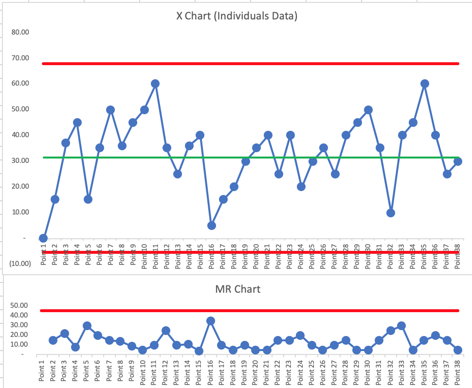
When I look at the PBC of individual waiting times, it’s “predictable” (or “in control”) with an average of 31.42. The limits are quite wide, but I don’t see any signals. I had 7 consecutive above the average (dumb luck in how I entered the data). I could see a scenario where, for example, afternoon waiting times are always longer than morning waiting times, so we could see daily “shifts” in the metric perhaps).
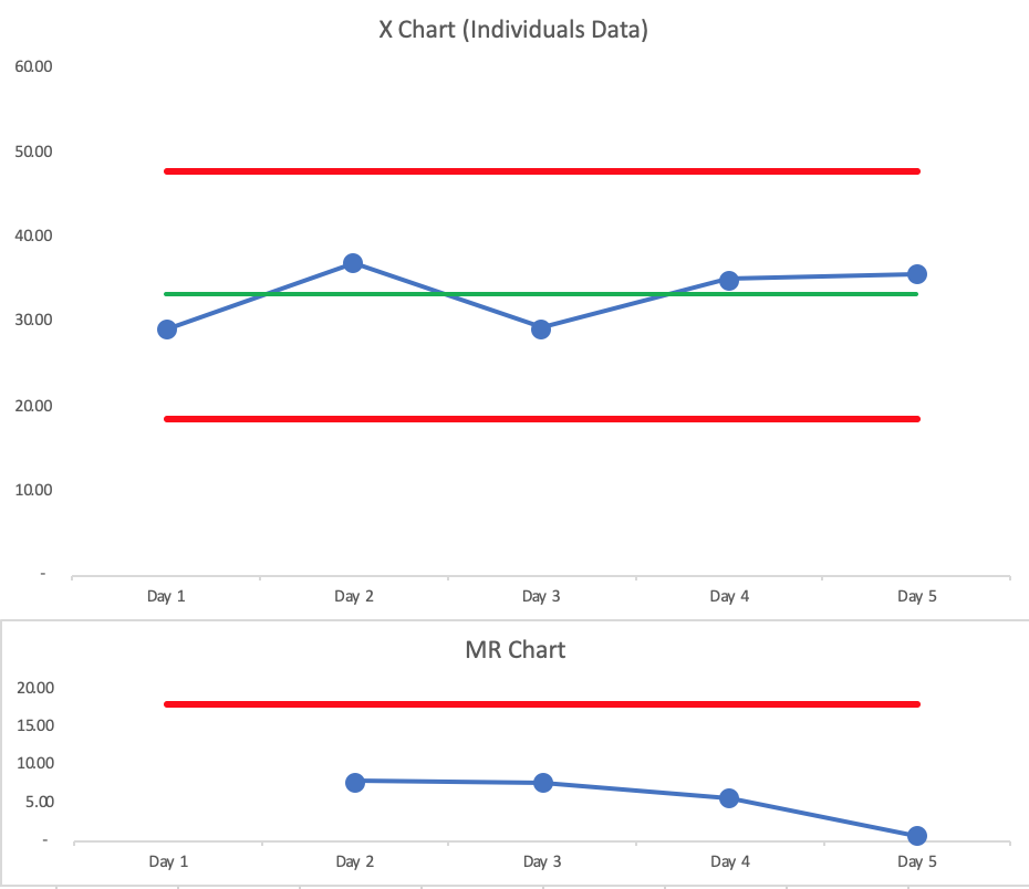
I then plotted the average waiting time for each of these 5 days (using a minimal number of data points to test these charts with admittedly minimal effort to start).
The average of the averages is 33.23. Not a huge difference.
The PBC for the daily averages is also predictable, with narrower limits, as I’d expect.
I think it’s fine to plot a series of averages. What matters most is how we interpret the PBCs — to avoid overreacting to every up and down in the data, for example.
The obvious differences between the two charts is the and the reduction in the number of points and the narrowing of the process limits caused by the averaging. Averaging is throwing away data – so we need to be aware that aggregating a limited set of data will reduce our diagnostic ability to identify potentially significant diagnostic signals that have assignable causes from which we can learn. There is a further risk of doing this when designing the required flow resilience we need to buffer common cause variation … by suppressing the actual point-to-point variation we may under-estimate the buffering capacity we need and run the risk of tipping our design over the chaotic transition point. Your experiment could be extended to include some signals in the source data set and then see what happens to them when you aggregate. 🙂
There are many issues I experience with averages, especially when measuring time. Doing a daily average gives low volume days the same weight as high volume days. Measuring months when there are different number of workdays or specific weekdays can incorrectly influence the data. This can be mitigated by measuring weeks.
It is difficult to know whether the change in average was due to just a few data points of non-nornal data, or from shifts in a large portion of the data. Control limits depend on a standard deviation and/or factor that may not accurately represent the distribution. With time data, it can have a upper tail that is not equivalent to the lower tail, but the process control charts assume they are the same. This can be mitigated by the use of trend chart of percentile lines directly from the raw data (5th, 25th, 75th, 95th percentiles in addition to the average), and you can show a trend line on the second axis of the volume to provide context on the x-axis dimension chosen.
I have even hidden outlier percentile data points when there are less than an appropriate number of data points for each x-axis data point (hiding the 95th data point if there are less than 20 data points or the 99th percentile if less than 100 data points, for example). These nethods may not follow statistical rules, but they do avoid using normality assumptions when they aren’t there.
Hi Ron – Thanks for commenting. I agree that bucketing data into weeks can help smooth out that day-to-day variation in a way that can be helpful, and not be misleading.
One thought… when you say, “avoid using normality assumptions when they aren’t there,” the one beauty of the XmR charts (“Process Behavior Charts”) is that the methodology doesn’t make any assumptions about normality. It’s very robust and we don’t even need to think about whether there is an underlying statistical distribution or what it is.
Using a calculated standard deviation with real world data makes bad assumptions about there being an underlying distribution (binomial or Poisson) so that’s one reason why the XmR chart calculations are, again, more robust and more accurate for real world data.
Here is a reference from Don Wheeler about why you don’t need to fuss with asymmetrical limits:
“The third lesson is that symmetric, three-sigma limits work with skewed data.”
https://www.qualitydigest.com/inside/six-sigma-column/do-you-have-leptokurtophobia-080509.html
Thanks for the comment, Simon. Yes, there’s some risk caused by aggregating data. There are some scenarios where a weekly metric shows a signal (a data point above the Upper Natural Process Limit) and that gets lost when the data is aggregated into a monthly metric.
Good points. I was speaking in terms of issues that occur when aggregating the individuals. Most of the data I analyze is too large and over too long a time frame to visually measure without subgrouping.
Even the Xmr uses control limit bands that are assumptive since they are equidistant from the overall means, when a larger variation may be on one side of the overall mean, for example. Though tedious, I have calculated the upper and lower control limits at different distances from the means based on the spread of each individually.
And, measuring performance against calculated control limits may not be as relevant as measuring against established targets/expectations.
“…measuring performance against calculated control limits may not be as relevant as measuring against established targets/expectations.”
Those are two different things. Measuring against the target tells you, perhaps, the voice of the customer (or it’s the “voice of management”). Comparing against control limits listens to the “voice of the process.”
We ideally want results that are “predictable” (in control) and “capable” (always better than the target).
Where were you taught to go through that “tedious” process for creating asymmetrical limits? I’ve never heard of that.
Individual times (like inventory levels) often are not independent data points… the wait time for the 10th person is correlated with the 11th, 11th with the 12th and so on. This a called autocorrelation and in the worst cases it produces narrow X chart limits from the low point to point variation. As long as the subgrouping of data is rational (shifts, days, etc.), using averages lets the power of the PBC’s shine through!
Wheeler says we don’t need to worry about autocorrelation. Most data is autocorrelated in the real world.
https://www.qualitydigest.com/inside/quality-insider-article/myths-about-process-behavior-charts-090711.html
“Myth Three: It has been said that the observations must be independent—data with autocorrelation are inappropriate for process behavior charts”
“While it is true that when the autocorrelation gets close to +1.00 or –1.00 the autocorrelation can have an impact upon the computation of the limits, such autocorrelations will also simultaneously create running records that are easy to interpret at face value. This increased interpretability of the running record will usually provide the insight needed for process improvement and further computations become unnecessary.”